Understanding Cover Letter Fonts Importance
Your cover letter is your first impression, a crucial opportunity to showcase your skills and personality to a potential employer. While content is king, the presentation significantly impacts how your words are received. One often-overlooked aspect of cover letter design is the font choice. The font you select can subtly convey professionalism, attention to detail, and even your understanding of workplace norms. A well-chosen font enhances readability, making it easier for the hiring manager to digest your qualifications and experience. Conversely, a poorly chosen font can distract from your message, making you appear unprofessional or careless. Therefore, carefully considering your cover letter font is essential for creating a positive first impression and increasing your chances of landing an interview. Choosing the correct font can make you standout.
Why Cover Letter Fonts Matter
Fonts play a vital role in communicating your message effectively. They influence readability, which is crucial for a cover letter. A font that is difficult to read will frustrate the hiring manager, causing them to skim or even disregard your application. A clear, legible font ensures that your qualifications are easily understood and that your professionalism shines through. Font choice also reflects your attention to detail. Choosing a font that is appropriate for the industry and the specific job you are applying for demonstrates that you have taken the time to understand the expectations of the employer. This attention to detail can set you apart from other applicants who may have overlooked this important aspect of their application. Remember, the font is a silent communicator, subtly conveying your understanding of professional standards and your commitment to presenting yourself in the best possible light. Ultimately, it can be the defining factor.
Fonts for Cover Letter Readability

Readability is the cornerstone of a successful cover letter. If the hiring manager cannot easily read your cover letter, all the efforts invested in crafting the perfect message will be in vain. Several factors contribute to a font’s readability. First, consider the font’s style. Serif fonts, such as Times New Roman and Georgia, have small strokes (serifs) at the ends of each letter, which can guide the eye across the page, making them suitable for longer blocks of text. Sans-serif fonts, like Arial and Helvetica, lack these serifs and often appear cleaner and more modern. Then, the font size must be appropriate. A font size of 11 or 12 points is generally recommended for cover letters. Too small, and it becomes difficult to read; too large, and it appears unprofessional. Also, consider the spacing between lines and letters. Adequate spacing enhances readability. Choose a font that is clear, simple, and optimized for easy reading. Prioritize fonts that are widely available and render consistently across different devices and operating systems to guarantee readability regardless of how the hiring manager views your application.
Top 7 Cover Letter Fonts to Use
When selecting a font for your cover letter, choose fonts that are professional, readable, and easily accessible. Here are seven of the best fonts to consider for your cover letter, offering a balance of style and readability. Each font has its unique characteristics, so select the one that best reflects your professional style and the industry you are applying to. Always prioritize fonts that maintain consistency across various devices to ensure the hiring manager views your letter as intended.
Arial
Arial is a widely used sans-serif font known for its clean and modern appearance. Its simplicity makes it easy to read on screens and in print. Arial’s versatility makes it suitable for various industries, and its professional appearance communicates a sense of clarity and efficiency. Its familiarity ensures that the reader has no difficulty reading your cover letter. When using Arial, maintaining an appropriate font size (11 or 12 points) and adequate spacing will contribute to its readability and overall professional presentation.
Times New Roman
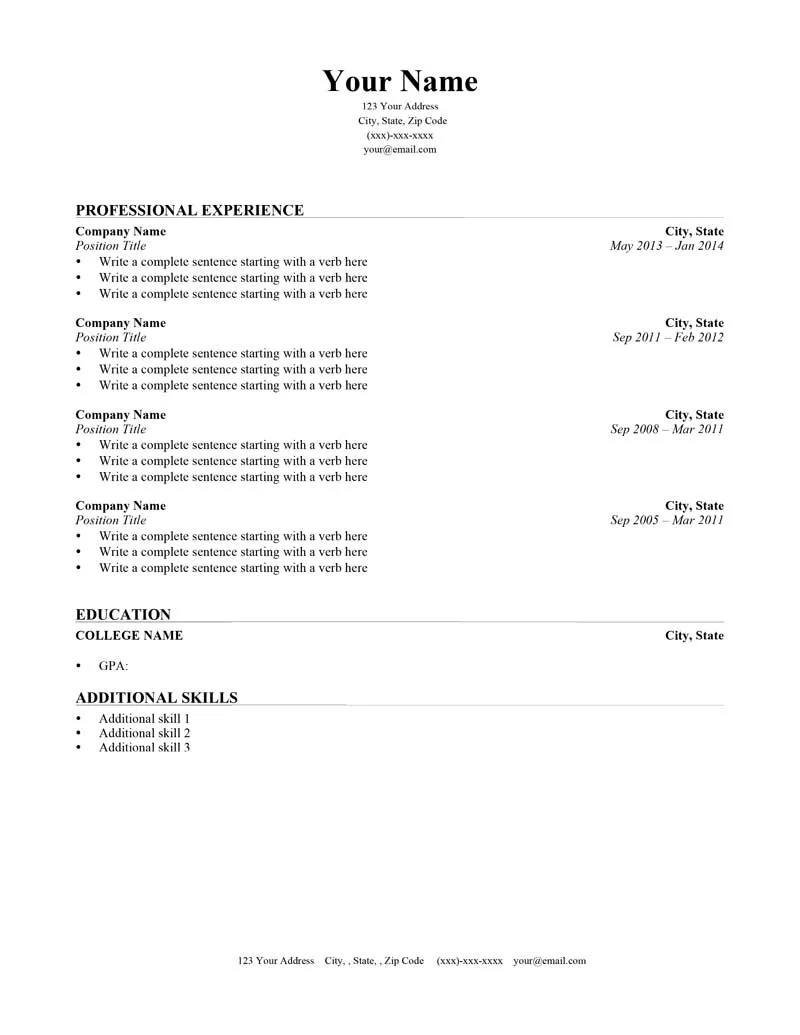
Times New Roman is a classic serif font that projects a traditional and formal image. Its elegant appearance makes it a good choice for more conservative industries or roles that require a high degree of professionalism. The serifs in Times New Roman aid readability in longer blocks of text, and it has a polished, refined look that can make your cover letter stand out. Because Times New Roman is a universally available font, its rendering is consistent across all platforms, and readability remains consistent. Consider using it if you want to appear more traditional.
Calibri
Calibri, a sans-serif font, offers a modern and clean look, widely used as a default font in many applications. Its design emphasizes readability, making it a versatile choice for cover letters. Calibri’s balanced proportions and moderate weight prevent it from appearing too bold or too light. Its use conveys a sense of contemporary professionalism, fitting for various industries. Ensure the appropriate font size and spacing for optimized readability. It’s a good option for job applications.
Helvetica
Helvetica is another widely recognized sans-serif font, known for its clean and neutral design. It offers excellent readability due to its clear letterforms and consistent weight. Helvetica is a versatile choice suitable for many professional settings, presenting a sense of straightforwardness and precision. Its simplicity ensures your content takes center stage. Use it when applying for jobs that value clear communication and a modern aesthetic. Use it at font size 11 or 12 with adequate spacing.
Georgia
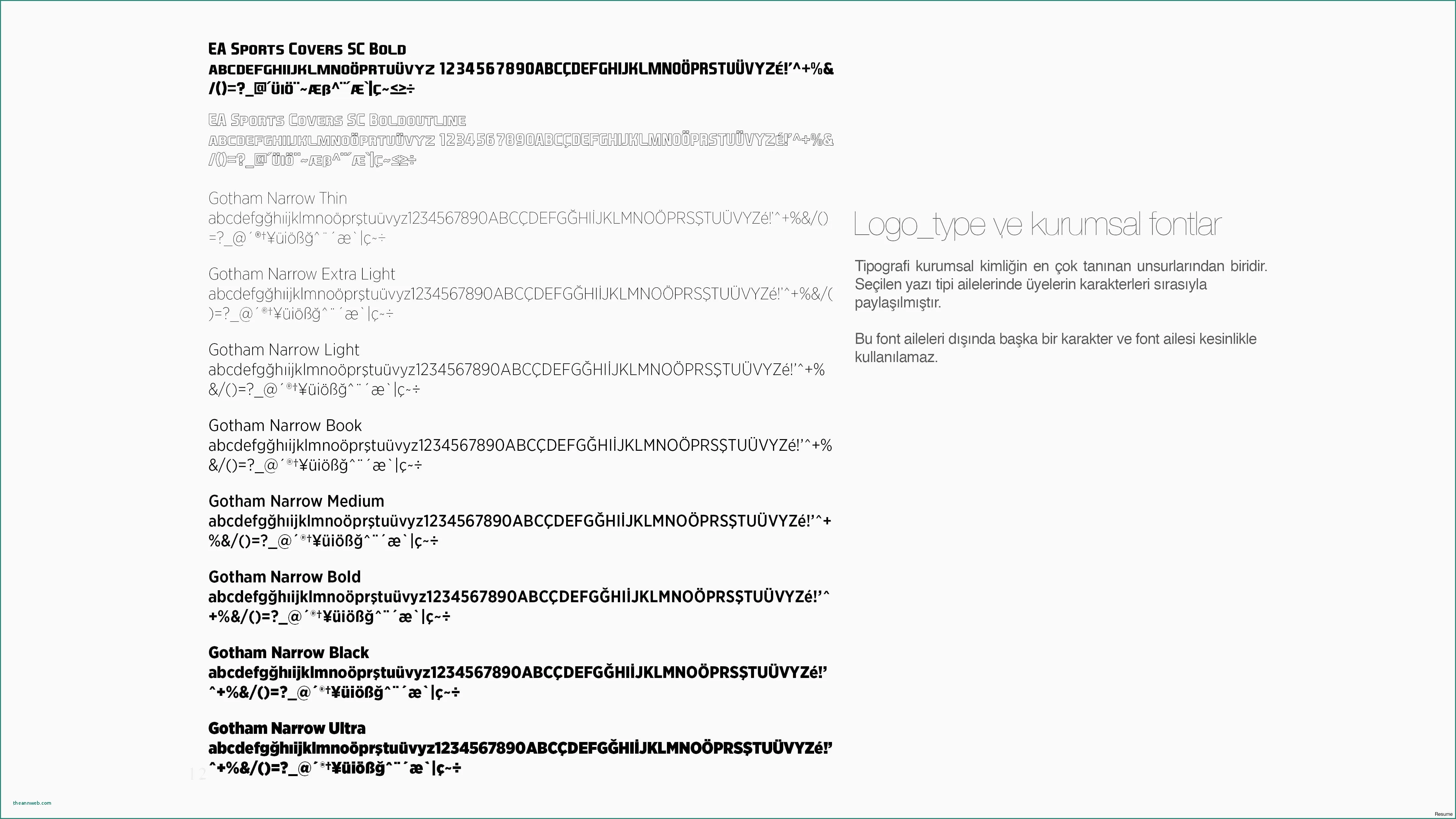
Georgia is a serif font known for its high legibility, even at smaller sizes. This makes it an excellent choice if you want your cover letter to be easily readable on various devices. Its slightly wider letterforms and open counters contribute to its readability. Georgia has a more casual feel compared to Times New Roman, making it suitable for slightly less formal industries or roles. Its classic and familiar style adds a touch of elegance and professionalism. Be mindful of the size, but otherwise, it is an excellent option.
Garamond
Garamond is a serif font that exudes elegance and sophistication. With its graceful letterforms and balanced proportions, Garamond offers high readability and a touch of formality. Its classic design makes it suitable for industries that value tradition and a polished aesthetic. When using Garamond, ensure the font size is appropriate for readability. It presents an image of refined professionalism. The classic style may distinguish your cover letter from others.
Verdana
Verdana is a sans-serif font designed for readability on screens, with slightly wider letterforms and generous spacing, making it easier to read. Its clean and modern design offers good legibility, even at smaller sizes. It’s a good choice if the hiring manager may read your cover letter online. Verdana conveys a sense of professionalism and approachability, making it versatile for various industries. Maintain appropriate spacing and size, usually 11 or 12, to get the best look.
Choosing the Right Font for Your Industry
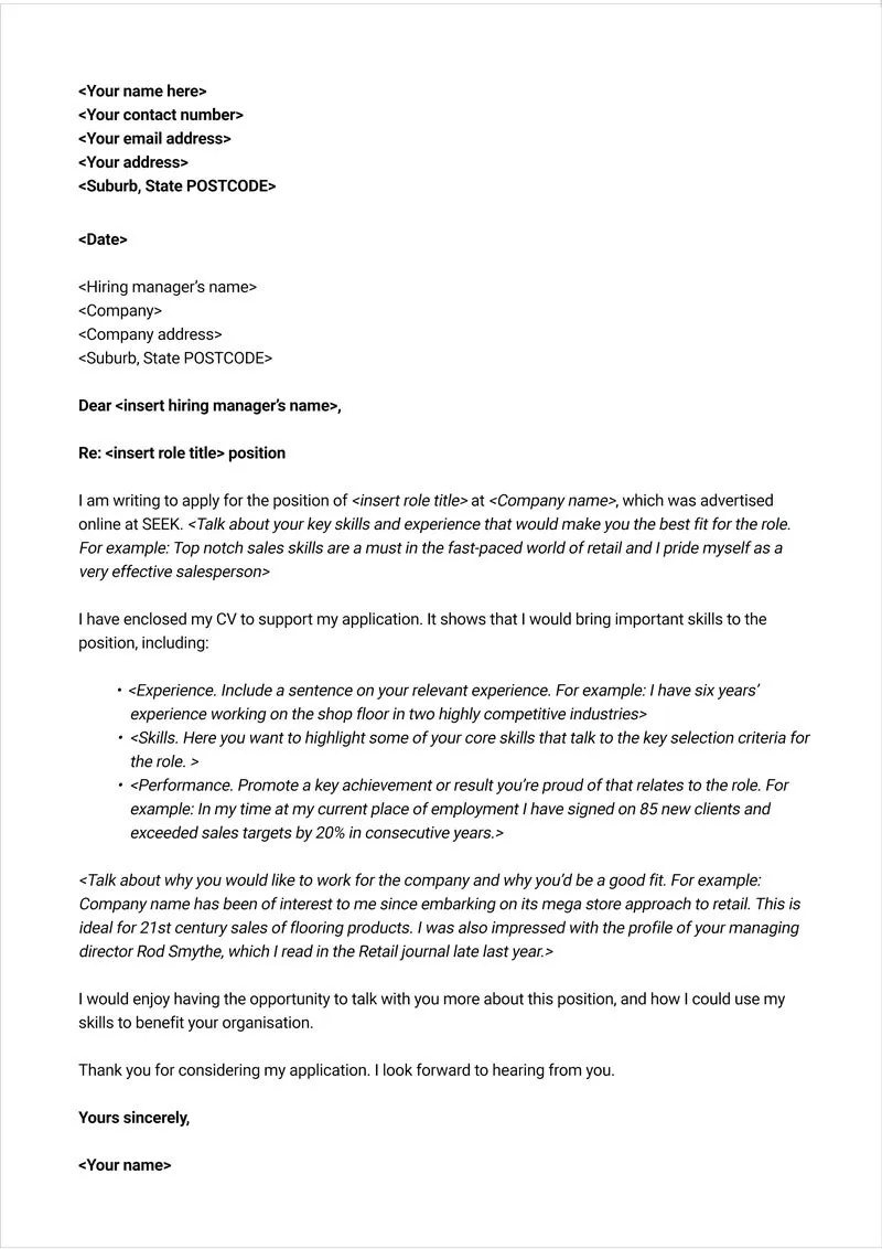
The best font for your cover letter can depend on the industry you are applying to. Some industries have more traditional norms, while others embrace a modern aesthetic. For example, a law firm might prefer Times New Roman or Garamond to convey a sense of formality and tradition, while a tech startup might opt for Arial or Helvetica, reflecting a more modern and streamlined image. Researching the company’s brand and style can provide insights into the type of font they might find appealing. Also, consider the specific role. For creative roles, you might have more leeway to select a font that reflects your personality and unique style. However, in more conservative industries, such as finance or government, a standard, professional font is generally recommended.
Cover Letter Formatting Tips
Beyond the font itself, other formatting choices can affect your cover letter’s presentation and readability. Proper formatting ensures that your cover letter looks polished and is easy to read. Use appropriate font sizes, typically between 11 and 12 points, to ensure that your text is legible without being too small or too large. Use a consistent font throughout the entire document. Avoid mixing serif and sans-serif fonts unless you have a specific design reason. Maintain adequate line spacing, typically 1.15 or 1.5, to avoid overcrowding the text, and utilize clear paragraph breaks to help the reader easily digest information. Use bolding and italics sparingly, and only to highlight key points or emphasis where needed. Using bullet points in sections where you are listing your skills, responsibilities, or achievements improves readability. Proofread your cover letter thoroughly, checking for grammatical errors and typos. Using a well-formatted cover letter conveys your attention to detail and your professionalism.
Font Size and Spacing
Font size and spacing play crucial roles in the readability and visual appeal of your cover letter. The ideal font size for cover letters is generally between 11 and 12 points. This range is large enough to be easy to read on any screen and print without appearing overly large or unprofessional. The appropriate spacing between lines and paragraphs is also essential. Use a line spacing of 1.15 or 1.5 to avoid overcrowding the text. This spacing will give the text some breathing room, which will make the cover letter more pleasant to read. The use of double spaces between paragraphs can further improve readability, as it helps separate different sections. Make sure that your chosen font size and spacing remain consistent throughout the document. By paying attention to these formatting aspects, you can improve the appearance of your cover letter, ensuring that the hiring manager has an easier and more enjoyable reading experience.
Font Color and Style
While the choice of font color in a cover letter is usually straightforward, with black on white being the standard, other stylistic choices can affect readability and the overall impression. As a general rule, stick to black text on a white background. This provides the best contrast and readability. Avoid using colored fonts or backgrounds, unless explicitly requested by the employer, as they can be distracting and difficult to read. The consistent use of bolding and italics can also highlight key points and make your cover letter more engaging. Use bold text sparingly for headings, key phrases, or to emphasize important achievements. Italics may be used to highlight the titles of publications or to add emphasis. Keep these formatting styles consistent throughout the document, and avoid overusing them. A well-designed cover letter provides a clean, professional aesthetic and clear communication of your qualifications.
Avoiding Font Mistakes
Several common font mistakes can hurt your cover letter. Avoid using overly ornate or unconventional fonts, as these can make your cover letter seem unprofessional or difficult to read. Similarly, avoid using too many different fonts in a single document. A mixture of fonts can create a disjointed and confusing impression. Also, do not choose a font that is difficult to read at smaller sizes or on a variety of screens. Be sure that the font you have chosen is widely available and renders consistently across various devices. Never use a font size that is too small or too large, as these can make your cover letter difficult to read. Proofread carefully for any formatting inconsistencies, such as varying font sizes, or spacing. By avoiding these common mistakes, you can ensure that your cover letter looks professional and is easy to read.
Common Font Errors to Avoid
Several font-related errors can detract from your cover letter. One common mistake is using obscure or unusual fonts that are not widely available. This can lead to your cover letter being rendered incorrectly on the hiring manager’s computer. Another error is using fonts that are too decorative or difficult to read. Fonts such as Comic Sans or Brush Script, while possibly suitable for casual communications, are unprofessional in a cover letter. Avoid excessive use of bolding, italics, or underlining, as this can make your text seem cluttered and distracting. Mixing different fonts or font styles within a single document can also create a disjointed and unprofessional appearance. Always maintain consistency in font selection, size, and style throughout your cover letter. Proofread the document thoroughly to ensure there are no inconsistencies in font or style. These small things can make the difference when applying for a job.
